HOUSE #3

Paul Clarke from Studio2 Architects crafts a new family home, retaining and recycling materials and motifs from the former house on site to create a sense of belonging.

scroll to main content

Project Details

MEMORY OF PLACE

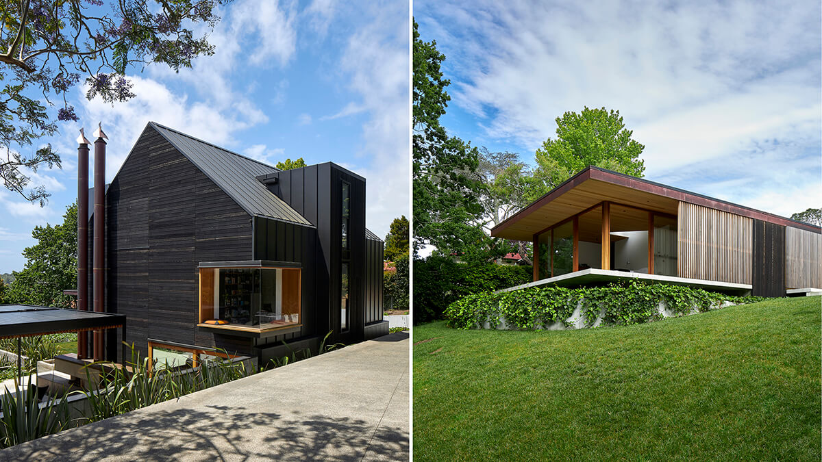
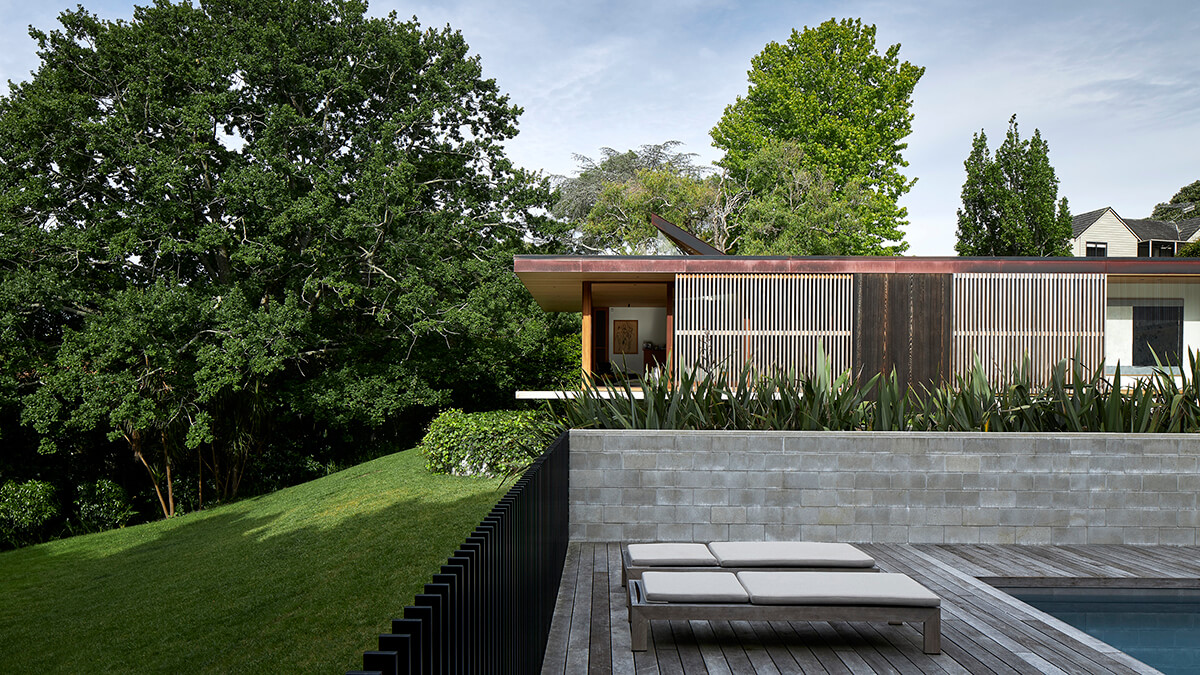
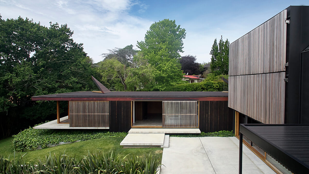
This central Auckland home opens up in unexpected ways: living spaces are orientated to sun and light; triangular light wells peel up from the roof; a 'skin' of sliding shutters allows manipulation of light and breeze. The family originally bought the site for its privacy and park–like feel. When the time came to update, they decided to honor their time in the existing home by remembering it in the details of the new. The floor level relates to the previous house, the ceilings heights are also similar, the timber shutters used for the in–situ concrete walls match the width of the original home's cedar weatherboards. Mataī stairs recall the floors of the previous home and the colored glass of the pivoting front door recalls a feature of another, earlier home.

Project Type: Suburban Home

Location: Auckland, New Zealand

Architect: Studio2

Photographer: Simon Wilson
THE FAMILY DYNAMIC

House #3 is named for the family's three sons, for the way the family is made up of three parts – children, father, and mother – and for its street number. It is an exercise in astute planning based on an understanding of the family's patterns of use and how it might ideally live. The horizontal volume, which contains the parent's suite, hovers effortlessly above the ground. The boys zone is on the upper level of the vertical volume. The family comes together in an open–plan living area finished with natural materials, including cedar and granite. "The kitchen is a central aspect of the home where enjoyment of food, beer, wine, family and friends creates memories daily," Paul says. "We spend a lot of time sitting at this island bench. We do a lot of entertaining and we have family who stay with us often. I love to slow roast. We do a lot of baking."

Exterior view of House number 3.

THE SOCIAL KITCHEN

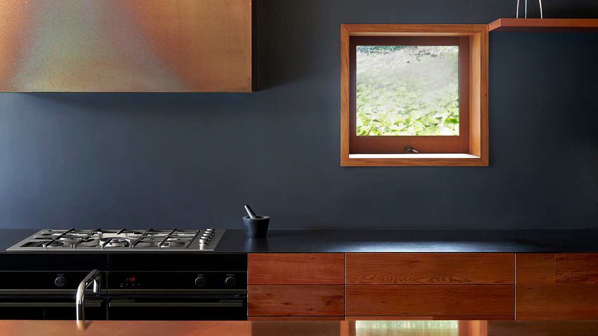
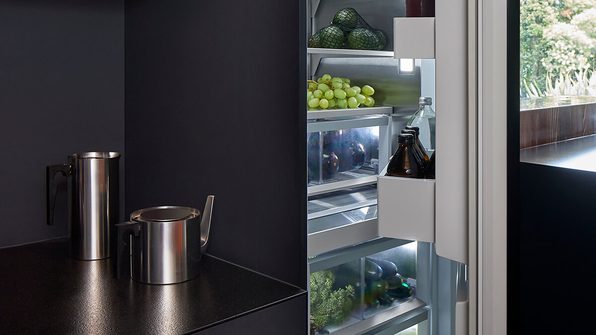
There are several different zones within the kitchen – cooking, coffee, prep, baking, storage and cleaning. Instead of including a scullery, the architect designed the kitchen with "all the appliances out" for all to use. Paul says while he's interested in the purpose of the appliance, he's not interested in its visibility within a space. As a result, he selected twin, black Minimal style ovens that visually recede into the cedar cabinetry – recycled and reworked weatherboards from the original house. Through seamless integration, the DishDrawer™ dishwashers and Column refrigeration are completely hidden. "People are often really interested in the appliances that we’ve used...The best testimony is that we have used them – and then explaining to people, this is how they look and feel as well."

Explore The Look

Cooktop Icon.

Contemporary Gas Cooktop

Explore our Contemporary Cooktops
Column Refrigerator Icon.

Integrated Column Refrigerator

Explore our Integrated Refrigeration
Column Refrigerator Icon.

Integrated Column Freezer

Explore our Integrated Refrigeration
Column Refrigerator Icon.

Integrated Single DishDrawer™ Dishwasher

Explore our Integrated Dishwashers